Case Study: Enhancing Search Bar Usability
As a UX Designer at Fyle, I improved our mobile app’s search bar. This case study outlines the challenges, analysis, and solutions implemented to enhance user experience.
Introduction
Imagine you’re in a rush to submit an expense report, but the search bar in your expense management app keeps showing irrelevant results. Frustrating, right? At Fyle, we discovered just how critical a well-functioning search bar is to our users’ experience.

Search bars are one of the most underrated components when it comes to providing a good user experience. When executed perfectly, the experience is smooth and seamless, and users won’t even notice it. However, if not done properly, it can irritate users and spoil their experience. It’s like eating a delicious biryani: you’re enjoying the overall taste until you accidentally bite into a clove. The flavour you were enjoying suddenly spoils the experience.

We faced a similar problem in the Fyle mobile application. Fyle is an intelligent spend management software. People use the mobile application to create expenses via receipt scanning or by manually filling out an expense form.
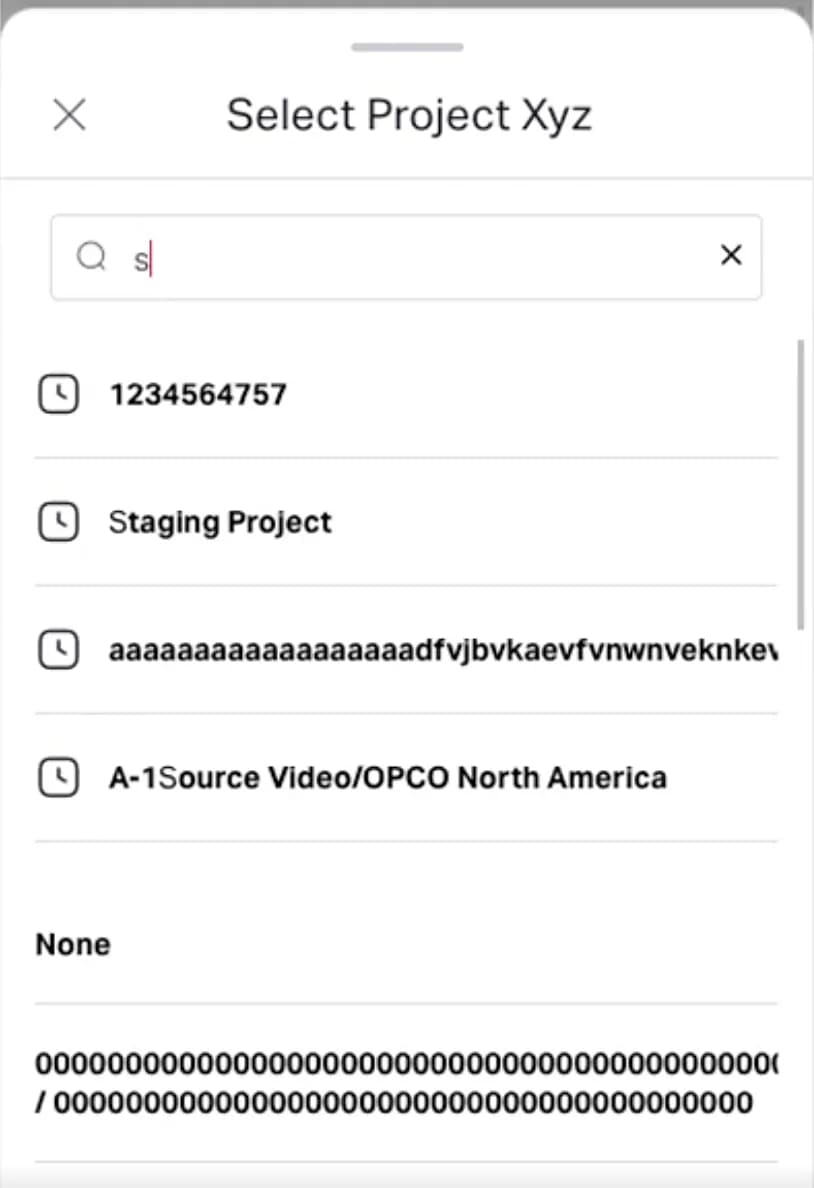
When users create an expense form manually, they need to provide the appropriate inputs or select from a list. We included a search bar inside the select list view, but we noticed that something was off. The ‘select list view’ is a dropdown menu where users can choose from predefined options.
Problem statement
When using the search functionality in the application, everything in the list view is highlighted, including text not typed by the user. This causes confusion and makes it challenging for users to select the desired option. Addressing this issue is crucial for improving the clarity and usability of the search feature.
Analysis of Common Search Implementations
It is very interesting to note that if we identify where we are searching, then determining what and why becomes easier. Let’s list a few of the most common places where people use search bars and understand the interactions to take inspiration for improving Fyle’s search experience.
Youtube
Amazon
Google
Gmail
Youtube
Where? — Searching in an undefined list.
What? — Looking for specific or unspecific content apart from what we have typed from an undefined list.
Why? — Searching for specific or unspecific videos.
YouTube highlights text not typed by the user to suggest content that might catch the user’s interest.
Amazon
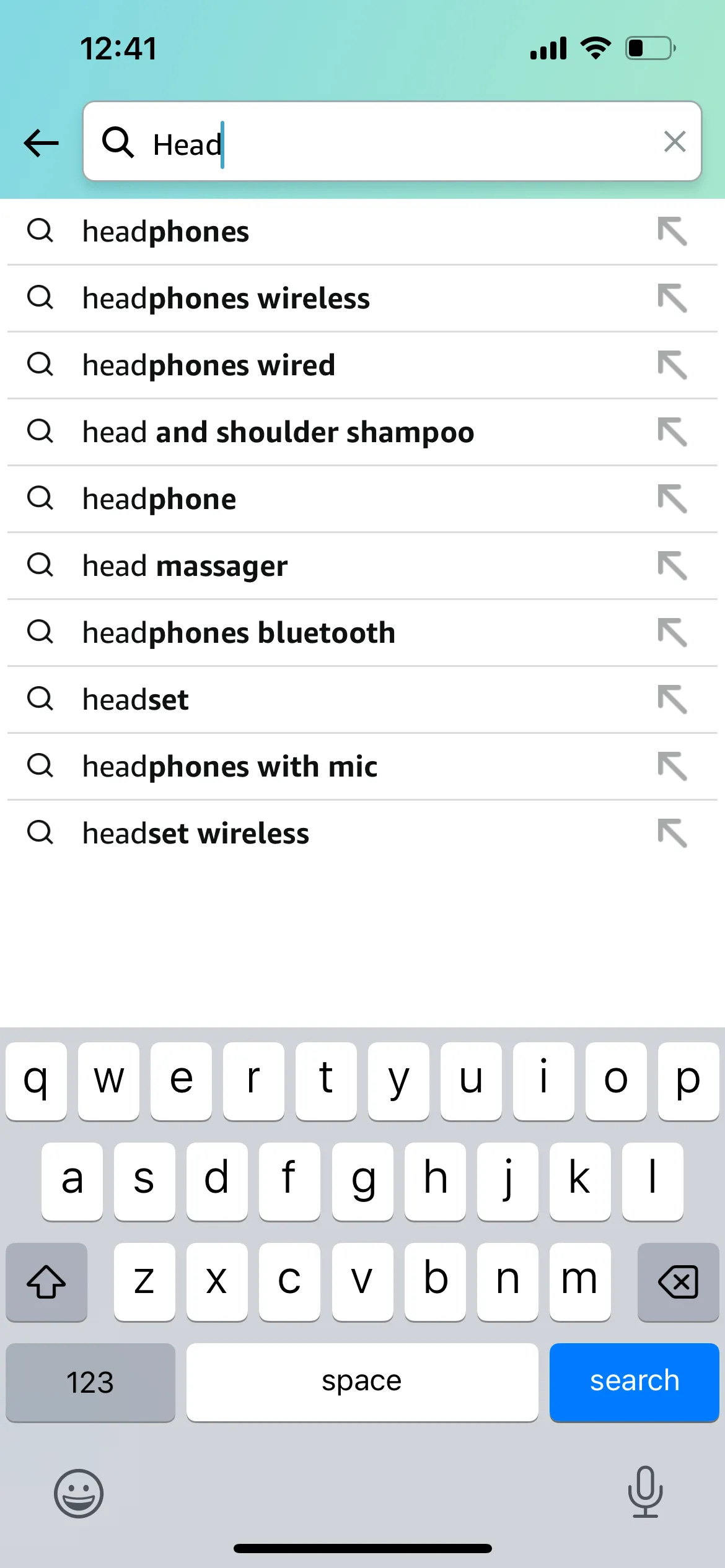
Where? — Searching within a defined list of products.
What? — Looking for specific products.
Why? — To find and purchase specific items.
Amazon highlights text beyond what the user has typed to help discover items they might find useful or interesting.
Google
Where? — Searching the entire web.
What? — Looking for information on any topic.
Why? — To find answers, information, or resources.
Google highlights additional text to provide the most useful information and suggestions.
Gmail
Where? — Searching within a personal inbox.
What? — Looking for specific emails or content within emails.
Why? — To locate and retrieve specific communications.
Gmail highlights text within emails to help users quickly locate specific messages.
Proposed Solutions and Decision
Applying to Fyle:
In Fyle, users search within a defined list when filling out an expense form manually.
Where? — Searching within a select list view in the expense form.
What? — Looking for specific items or categories to complete the form.
Why? — To accurately fill out the expense details.
We considered several options to improve the search functionality:
Highlight Exact Matches Only
Pros: Provides clarity by showing only what the user typed.
Cons: Might miss suggesting related items that could be useful.
Contextual Suggestions with Highlights
Pros: Helps users discover relevant items they might not have considered.
Cons: Could still cause confusion if not implemented carefully.
Adaptive Filtering Based on User Behavior
Pros: Learns from user behavior to prioritize the most relevant results over time.
Cons: Requires time to adapt and might initially present irrelevant results. Additionally, the effort-to-impact ratio is high, as it requires significant resources to implement and fine-tune the algorithm.
Chosen Solution: Highlight Exact Matches Only
We decided to go with highlighting exact matches only because it addresses the primary issue of user confusion directly. This solution ensures users can quickly and accurately find the necessary items for their expense reports without being overwhelmed by irrelevant suggestions.
Conclusion
By tailoring Fyle’s search bar to highlight exact search queries, we ensure users can quickly and accurately find the necessary items for their expense reports. This enhancement not only improves user satisfaction but also streamlines the overall process, making Fyle an even more efficient tool for managing expenses.


