
CSS Tweaks & Animations
How to Elevate User Experience with Simple and Effortless Styling Techniques

Imagine using an app where each change happens abruptly, leaving you feeling disconnected. Now, imagine those same transitions softened by subtle animations that guide you naturally from one state to the next. With thoughtful CSS animations, a user interface becomes more than just a collection of static elements—it becomes an intuitive space that speaks to the user.
Animations add a layer of sophistication without overwhelming the design. They serve as gentle cues, indicating where to focus attention and how to navigate complex information seamlessly. As Ellen Lupton says, "The design speaks to the soul of the user. When done well, it blurs the line between the human and the interface, leaving only experience.“
Hi, I’m Sahil K. (MTS1 @Fyle). Today, we will explore how CSS animations can elevate the user experience by transforming everyday interactions into a smooth, engaging journey. In this post, we’ll discuss the basics of CSS animations, explain why they matter, and share practical tips for using them in your projects. Let’s dive in and explore how simple tweaks can bring your interface to life.
What are interactive animations in web apps?
Interactive animations in web apps respond to user actions, such as clicks, hovers, or scrolling. These animations enhance usability by providing feedback, guiding users, or making interactions more engaging. For instance, below I have mentioned common types of interactive animation in web apps:
Hover Effects – Buttons, links, or elements change appearance when hovered over.
Click Animations – Visual feedback, like a ripple effect, when an element is clicked.
Scrolling Animations – Elements fade in, slide, or animate based on scroll position.
Loading Animations – Animated loaders that keep users engaged while waiting.
Drag-and-Drop Animations – Smooth movements when dragging and repositioning elements.
Form Field Animations – Highlighting or expanding input fields upon focus.
Page Transitions – Smooth animations between different pages or sections.
To explain this with a practical example, we recently added a small dropdown animation to the side navigation of the Fyle web app. Just by looking at it, you can see how it can make app navigation smooth and visually appealing while keeping the interface clean.
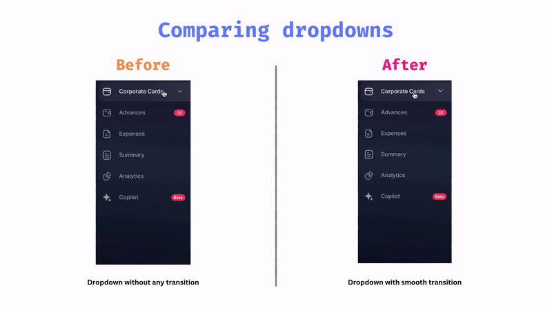
Fig: Adding transition in the dropdown
Learning the fundamentals of CSS animation
Now that we’ve covered the what and why of CSS animations, let's see how to implement them. CSS animations rely on three fundamental building blocks that define how elements move and transition on the screen:
Transition Properties – Allow smooth changes between different states when an element is interacted with (e.g., hover effects).
Keyframes – Specify how an element should look at different points in time.
Animation Properties – Control how the animation behaves, including its duration, timing function, and repetition.
Let’s break them down one by one.
1. Transition Properties
CSS transitions enable smooth changes between two states when an element is interacted with—such as hovering over a button, focusing on an input field, or clicking a menu item. Instead of an abrupt change, transitions create a gradual shift in styles, making the UI feel more polished and responsive.
How Do Transitions Work?
A transition requires three key parameters:
CSS Property – Specifies which property to animate, such as
color,opacity,transform, etc. You can also useallit to apply the transition to all properties at once.Duration – Defines how long the transition should last (e.g.,
0.5s,1s).Timing Function – Determines the speed curve of the transition, such as
ease-in,ease-out,linear, etc. (We’ll explore this in more detail later in this blog!)
Example 1: Improving a Dropdown Animation
Let’s say you're building a dropdown button with an arrow icon. In its default (closed) state, the arrow points downward. When the dropdown opens, the arrow rotates 180 degrees to point upward.
Without a transition, the arrow changes direction instantly, creating a jarring effect:
.arrow-down {
  transform: rotate(0deg);
}
.arrow-up {
  transform: rotate(180deg);
}
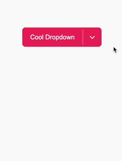
Fig: No transition
Now, with just one simple change—adding a transition—the movement becomes smooth:
.arrow-down {
  transform: rotate(0deg);
  transition: transform 0.35s ease;
}
.arrow-up {
  transform: rotate(180deg);
  transition: transform 0.35s ease;
}
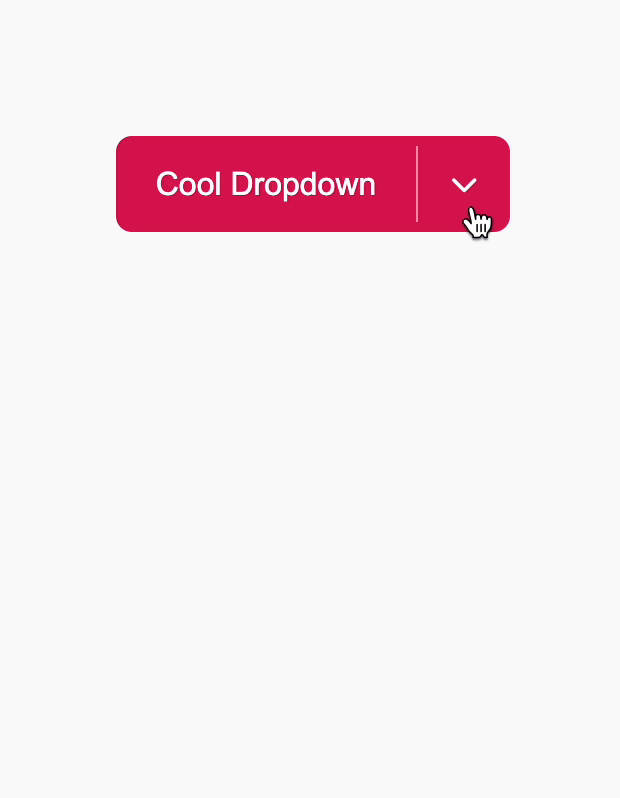
Fig: With smooth transition
👉 And so you can see with just a single line of CSS, the interaction feels significantly smoother!
Example 2: Adding a Hover Effect to a Button
Another common use case for transitions is hover effects. Let’s add a smooth color change and a slight scaling effect when a user hovers over a button.
button {
  background-color: #ff7f50;
  color: white;
  padding: 10px 20px;
  border: none;
  cursor: pointer;
  transition: background-color 0.3s ease-in-out, transform 0.2s;

  &:hover{
    background-color: #ff4500;
    transform: scale(1.05);
  }
}
👉 When users hover over the button, it smoothly changes color and scales up slightly, making it feel more interactive and engaging. The
transitionproperty is a simple yet powerful way to enhance UI interactions with minimal effort. Transitions make interactions feel natural, fluid, and visually appealing whether it’s a dropdown, a button, or any other interactive element.
Understanding Timing Functions
Before moving any further let’s understand the timing functions. The timing-function CSS property sets how an animation progresses through the duration of each cycle. A timing function determines how an animation progresses between the start and endpoints. It defines the speed curve—whether the animation starts slow and speeds up, slows down at the end, or follows another pattern.
For instance, when you write 0.3s ease-in-out, this means the transition will start slow, speed up in the middle, and slow down at the end.
Under the hood, timing functions use cubic Bézier curves to interpolate values over time.
Cubic Bézier Function
Most CSS easing functions are defined using a cubic Bézier function:
Where:
t is the time progression (from 0 to 1),
P0 and P3 are fixed at (0,0) and (1,1)
P1 and P2 define the curve’s control points.
CSS provides several predefined timing functions:

For example, ease-in-out can be written in CSS as:
transition: all 0.5s cubic-bezier(0.42, 0, 0.58, 1);
// OR
transition: all 0.5s ease-in-out;
// Both mean the same, but with cubic-bezier you can create custom timing functions, allowing full control over the speed curve.
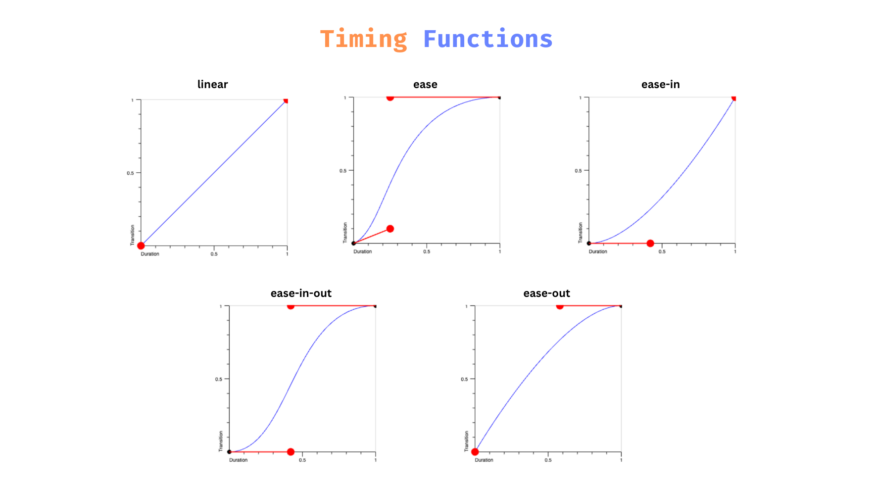
Fig. Transition Timing Functions
2. Keyframes: Defining Complex Animations
While transitions are perfect for simple state changes, keyframes open the door to multi-stage, intricate animations. With keyframes, you have complete control over how an element changes at various points during its animation cycle.
A keyframe rule is defined using the @keyframes at-rule. Here’s the typical structure:
@keyframes exampleAnimation {
  0% {
    /* Starting state */
  }
  50% {
    /* Midway state */
  }
  100% {
    /* Ending state */
  }
}
Percentages vs. Keywords:
You can use percentages (0%, 25%, 50%, etc.) or the keywords
from(0%) andtofor (100%). Percentages give you control, while keywords offer readability for simple animations.Multiple Checkpoints:
Keyframes allow you to define as many stages as needed. This is invaluable when creating complex animations like multi-color gradients, elaborate transitions, or animations that require several “poses.”
Let’s understand this with examples:
Example 1: Beating heart 💓
.heart {
  margin-top: 200px;
  text-align: center;
  font-size: 100px;
  animation: pulse 1s infinite ease-in;
}
@keyframes pulse {
  0% { transform: scale(1); }
  50% { transform: scale(1.2); }
  100% { transform: scale(1); }
}
<div class="heart">💜</div>

Fig: Heartbeat animation
Example 2: Bouncing ball 🥎
.ball {
  width: 50px;
  height: 50px;
  background-color: #ff7f50;
  border-radius: 50%;
  position: absolute;
  left: 50%;
  transform: translateX(-50%);
  animation: bounce 2s infinite ease-in;
}
/* Bounce animation: the ball moves from near the bottom wall to near the top wall */
@keyframes bounce {
  0%,100% {
	  /* Ball's bottom touches the bottom wall */
    top: calc(100% - 20px - 50px); // 50px height of ball, 20px height of wall
  }
  50% {
    top: 20px; /* Ball is near the top wall; */
  }
}

Fig: The result of the bouncing ball animation
Example 3: Hand wave animation 👋
.wave {
  animation-name: wave-animation;
  animation-duration: 2.5s;
  animation-iteration-count: infinite;
  /* Never stop waving :) */
  transform-origin: 70% 70%; /* Pivot around the bottom-left palm */
  display: inline-block;
}

@keyframes wave-animation {
  0% { transform: rotate(0deg); }
  10% { transform: rotate(14deg); }
  20% { transform: rotate(-8deg); }
  30% { transform: rotate(14deg); }
  40% { transform: rotate(-4deg); }
  50% { transform: rotate(10deg); }
  60% { transform: rotate(0deg);}
  100% { transform: rotate(0deg);}
}
Fig: Hand wave animation
Advanced Techniques with Keyframes
Chaining Animations: You can create sophisticated effects by chaining keyframes within a single animation.
Custom Timing for Each Stage: Although CSS doesn’t let you specify a different timing function for each keyframe segment directly, you can simulate varied speeds by carefully adjusting your percentage markers. For instance, a quick start might be represented by a short interval between 0% and 20%, followed by a longer, more drawn-out transition.
Looping and Infinite Animations: Keyframes shine when used with properties like
animation-iteration-count. For continuous, repeating effects (e.g., an infinite loader)
Comparison: Keyframes vs. Transitions

Keyframes provide a far richer set of options for animations that need to convey more than just a change from one state to another.
3. Animation Properties: Fine-Tuning Behavior
Beyond defining your animation with keyframes, CSS offers a suite of animation properties to control the playback, timing, and overall behavior of your animations. Understanding these properties in depth allows you to refine your animations to behave exactly as you intend.
Core Animation Properties

Best Practices for CSS Animations
Here are some best practices to ensure your animations enhance rather than hinder the user experience:
Prioritize Performance: Properties such as transform and opacity are typically hardware-accelerated by the GPU, which offloads rendering tasks from the CPU. However, when these GPU-friendly properties are combined with complex logic or with animations that trigger layout recalculations (such as those involving width, height, or position), it can lead to performance issues—including CPU bottlenecks. To maintain smooth performance—especially on mobile devices—it’s best to use subtle animations that rely primarily on GPU-accelerated properties and avoid unnecessary recalculations that overburden the rendering engine
Respect User Preferences: Ensure that animations do not interfere with the content’s readability or cause discomfort.
Keep Animations Purposeful: Every animation should have a clear purpose—whether guiding user attention, providing feedback, or indicating a state change. Maintain consistent animation patterns across your application to build a coherent user experience.
Conclusion
There is so much info to cover, but instead of describing every detail here, I'll let your curiosity guide you through the search. Explore all the properties as you wish and uncover the endless possibilities that CSS animations have to offer!
Remember: Animations don’t distract—they guide and inform. Experiment with different techniques, respect user preferences, and keep performance in mind. With practice, you’ll find the perfect balance that brings your web apps to life.
Happy animating!