Implementing redesigns for Card Details page
Redesigning Details and Actions for Corporate Cards on Fyle
Hi everyone, I’m Aastha, a Member of Technical Staff here at Fyle.
I’ll be talking about the Engineering side of a frontend redesign initiative that was taken up for the Card Details page on the Fyle web app. This initiative happened as a part of the redesign of our pages. We also moved our existing dialogs on the app to Angular from AngularJS.
What is the Card Details page?
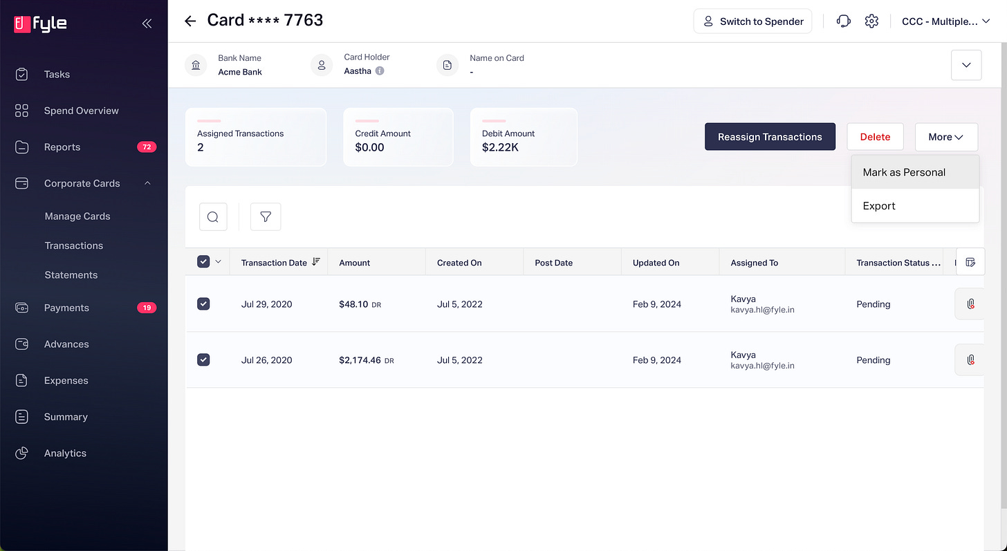
This page displays all the relevant information associated with a Corporate Card on Fyle’s web app. Every Corporate Card can have zero or more transactions associated with it. Those transactions and the actions associated with them were also displayed on this page. An Admin can use it for
Assigning cards to employees of their organization
Changing and removing employees on an already assigned card
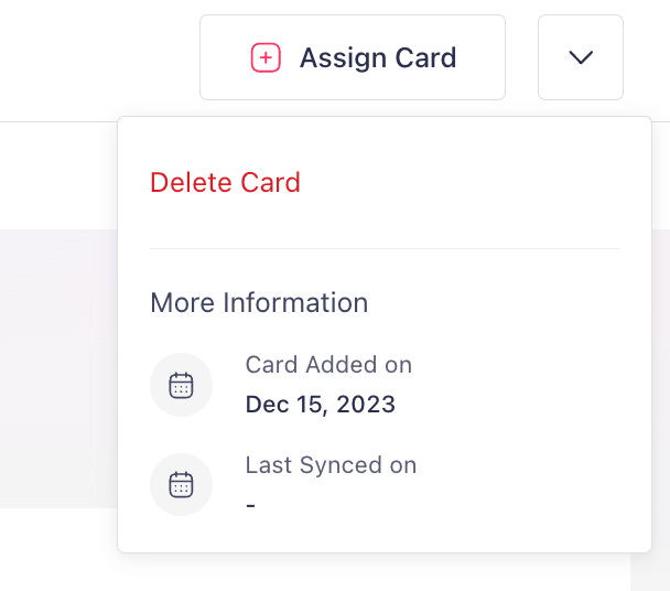
Deleting a card and all the associated transactions
Assigning Individual transactions to different employees
Marking Debit transactions as personal, and Dismissing credit transactions if required
What was the initiative about?
This initiative was about implementing the newer design for the Card Details page. This page displayed transactions and details associated with a particular Corporate Card.
The redesign was taken up for a few reasons:
The older component for displaying the list of transactions on this page was less reusable, and heavily based on passing properties to a singular component. With the newer components introduced, the entire page became more modular. This helped us check usage and remove features with lesser usage.
To add to the Angular Migration efforts for our web app
The initiative into three parts according to the areas that needed to be covered:
Moving the tabular view for transactions to new designs
Redesigning page header for showing card details and related actions
Rewriting Dialogs that perform Card and Transaction related actions in Angular
Step 1: Planning
Before writing the components, I had to put together an Engineering Design doc.
The parts covered in the document included the following.
Component Breakdown
The components were divided according to use case and reusability. The dialogs were created as separate components. The final folder structure looked like this:
.
├── header-component/
├── header-component.module.ts
├── member-details/
├── dialogs/
│   ├── delete-card-dialog/
│   ├── delete-transactions-dialog/
Deciding on any new external libraries or components to be used
Fyle web app uses PrimeNg as a UI library. After this redesign, certain parts used PrimeNg components. Here are a couple of scenarios that came up in this initiative:
A drop-down menu with both CTAs and presentational Components:
There were a couple of options to build this out:
PrimeNg’s Menu component: https://primeng.org/menu
PrimeNg’s Overlay API: https://primeng.org/overlay
The Overlay API was more customizable, so finally, p-overlay it was used with custom styling for CTAs present within it.
Copying from Clipboard
There was a dialog where there was a requirement for copying Fyle’s support email in case the user required more assistance. To implement the Copy to clipboard option in Angular, several options were considered.
Using the Clipboard service from
@angular/cdkin a custom attribute directive.Using
@angular/cdkcdkCopyToClipboarddirectiveThis had less flexibility in performing actions after copying, like displaying a toast message.
ngx-clipboardThis was a third-party directive, fairly simple to use. The con against this was there was including this would have been an additional dependency.
Building a Custom Directive
This was the most complex of the four options and would be significantly more complex to use, test, and maintain.
Ultimately, we settled for option one, since it was the simplest, and required no additional plug-ins.
Describing Components
For every component to be built, the inputs, outputs, services, and corresponding API request/response models were listed first.
Consider the following component displaying the Bank name for a card:
The above can be built as a simple presentational component, with no outputs.
The inputs would be as follows:
`fieldName`: string
`iconName`: string
`fieldValue`: string
Additionally, the API calls to be used for this purpose were listed separately, along with the Request/Response models they would use
Step 2: Implementation
This section lists some notable things from the Development phase.
Communication between Angular and AngularJS
This was crucial for performing actions like reloading and redirection across the whole page (written in AngularJS) from the dialogs written in Angular. This was achieved in two ways:
Using
ng-onover event emitted from Angular in the AngularJS controller:Using this, an event handler from AngularJS was bound to the event emitted from Angular.
For example, on removing an Assignee for a card:
The API call for removing an assignee would go out from the Angular component
On successful removal of card assignee, the redirection will need to go to the page for unassigned cards.
This redirection would be handled through AngularJS
$state.go. An event would be emitted from the Angular component embedded in the AngularJS controller to trigger that.The handler in the AngularJS controller would then trigger redirection, and display a toast message.
Using
ng-propfor passing values from AngularJS controller to Angular component.Example usage
ng-propandng-on:
<!--In AngularJS template-->
<details-header-ce flex ng-prop-id="vm.id" ng-on-action_success="vm.onActionSuccess($event)"><details-header>
Optimising Controller logic
Pre-existing and older logic from the AngularJS controller was taken up and split out into multiple methods.
The initial code example in typescript
// Initial Setup method in controller
setupTransactions(): void {
    const txns: Transaction[] = [];
    const txnWithExpenses: Transaction[] = [];
    for (const txn of this.txns) {
      const condition = this.dialogType === 'actionA' ? txn.amt < 0 : txn.amt > 0;
      if (bankTxn.state === 'INIT' && condition) {
        eligibleTxns.push(bankTxn);
      }
      if (
        txn.state === 'ONGOING' &&
        txn?.details.length > 0 &&
        condition
      ) {
        const isallExpenseBelowReported = txn.details.every((txnDetail: TransactionDetails) => {
             // logic for finding below reported expenses
        });
        if (belowReported) {
          txns.push(bankTxn);
          txnWithExpenses.push(bankTxn);
        }
      }
    }
    this.txns = txns;
    this.txnCount = txns.length;
    this.txnsWithExpenses = txnsWithExpenses;
  }
The above method was unoptimized and difficult to read. The logic was separated into different methods.
// Final refactored method :)
private setupDialog(): void {
    this.filterByAmount();
    this.addInitialisedTxns();
    this.addInProgressTxns();
    this.setupCurrencyAndAmount();
  }
Step 3: Testing
Before releasing the dialogs, it was necessary to test them thoroughly. While testing, the following kinds of cases were considered:
What would the user normally try to achieve?
What would be the most amount of bulk API calls that can be possibly run through the UI?
Any special cases where templates had content/error message variations.
Error cases for validation fail.
Cases where an operation takes too much time.
Step 4: Releasing the changes
The changes were released in two parts:
Major release 1 - this was the release of the entire page redesign. This included the list view components and the redesigned header.
Major release 2 - this was done as and when each of the redesigned dialogs was individually implemented and tested.
Learnings
For me, there were a bunch of learning associated with this initiative:
Picking up on how to work with Angular and RxJS
Finding the difference between
mapandswitchMap- the hard wayOptimizing code in Angular, and writing proper tests


