Redesigning the Fyle Chrome Extension
Who Am I?
Hey folks! I’m Hari, working as a Product designer at Fyle for the past few months. I’m new to the Design world, and formerly I worked as a Software Admin. I joined Fyle to explore the design space and resolve challenging issues the users face.
WTH is Fyle Chrome Extension?
Fyle’s Chrome Extension is the world's 1st extension that helps people to track and manage expenses from Gmail. Our goal is to automate the cumbersome expense tracking process by making AI do the work for the users.
Flight tickets, travel reservations, cabs, food bills, shopping bills, etc. - Fyle automatically extracts all the relevant information from the inbox with a single click.
How does the Fyle Chrome extension work?
Extracts and fills data from the receipt to the expense form with a single click.
Attaches the receipts to the expense
Automatically checks against active company policies before submitting it for approval.
Instantly reconciles the receipt with existing corporate card transactions.
One click and all the required data from the receipt will be automatically extracted.
Why was the redesign needed?
Though our Fyle extension offers many valuable features to its users, the UI is old, outdated and not aligned with our Fyle Design language. Adding to that, we also found a lot of design and usability issues.
Fyle Design language is a design language system that articulates how our product should look, feel and behave for the users.
The Design Journey ✨
Research
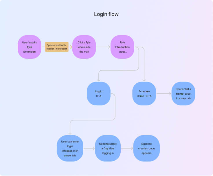
Initially, we started this initiative by recording the current user flow. This helped us understand and predict cognitive user patterns. This leads us to develop solutions that can be aligned in a flow state.
The concept of flow in UX design was first coined by the psychologist Mihaly Csikszentmihalyi. He deemed it a highly focused mental state where the user is fully immersed in what they are doing and the task they aim to accomplish.
Investigation 🔍
Following that, we analyzed and evaluated the current screens and found design, consistency and UX issues.
Some of the Design issues:
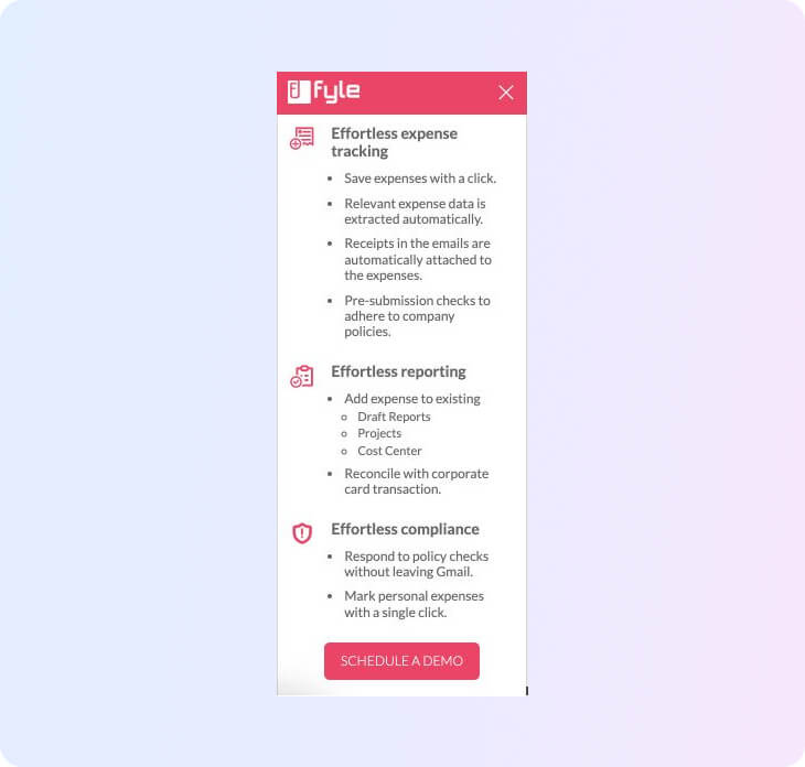
Too much content placed on the Introduction page - Users might skip this without reading.
The receipt attachment icon on the expense creation page looks clickable, but it's not and can mislead the user.
The Logout option is positioned at the bottom and placed close to the CTA on the Expense creation page.
Placeholder text in the Input field is covered with yellow/orange, which resembles a warning state.
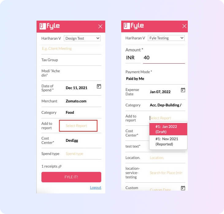
The dropdown input field reflects like a text input field instead of a dropdown.
If a dropdown field got auto-filled, it's difficult for the users to consider that as a dropdown since we are not showing it as a dropdown input field; instead, we are showing it as a text input field.
If users want to change any data on the dropdown field, they need to delete the existing data in the field first, and then they have to choose an option. (ideally, it should be possible to change the value without clearing the text)
Some of the Usability issues:
The expense status should not be Fyled, Draft etc. (terminology needs to be updated).
The name is placed at the bottom of the edit expense page, and Org info is missing.
Name and Org are placed at the bottom of the page in the extension’s View Expense page.
When the extension is loading another page, the intro screen comes up randomly
After that, we also analysed some customer queries and did complete competitive research. This helped us to understand how our customers are using the extension. How other products are handling this space for the users.
Fyle Chrome Extension outperforms the competitors in the chrome extension space. The only extension in the spend management industry helps users create expenses with a single click.
High Fidelity Designs 🔄
Following the research, we started to design UI screens. After an eternity of designing and iterating with tens of meetings, we eventually handed the designs to the Engineering team. As a product designer, I can assure you that this is one moment that designers can sigh a relief after handing over the designs to the engineers.😜
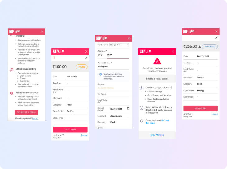
Here are the few screens of Fyle extension before and after the redesign,
Major takeaways 🔥
This was my first big initiative at Fyle, where I was expected to deliver high-quality work within a short period. Some of my takeaways and learnings are:
Designing ‘in-between’ screens in a user flow (Loader, Hover, etc.)
As a designer, I found it vital to design the ‘in-between’ screens in a user flow. This allows the stakeholders to go through the designs and understand the user flow effectively.
Documenting and designing all use cases & Edge cases
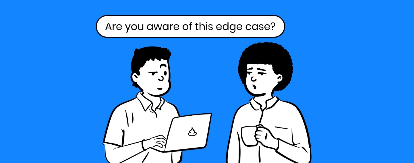
Often designers get these questions after we finish designing a solution for our product and believe all the things are correct, and then someone from the engineering or product team would ask us:
Is this use case handled? or is this edge case handled? 😛
As a designer, I learned it's essential to cover and design for all types of use cases, even if it is a rare edge case. If these are not addressed, it can potentially negatively impact the user experience.
Organizing the designs
One of the essential things I learned from this initiative is to organize the designs better so that everyone can access the file and go through the design at any time. This will be really helpful for Non-designers as they can explore our work effortlessly.
Analyzing the tech constraints
Analyzing the tech constraints during the design process helps save time. One of the critical factors to consider is to avoid going back and forth during the design stage.
Handoff stage
The Handoff stage between designers and developers is really crucial for a product. I learned that a designer has more responsibility to deliver accurate information and communicate with them effectively. Any error can affect the outcome and the developer’s time and create rework.
Shoutout 📢
Thanks a lot to Aditi Saini and Swapna Nayak for their guidance throughout the initiative. I learned how to take on such a massive redesign project, break it down into chunks, handle all use cases and deliver a better user experience for the users.
Thanks to Aditya Bansal and Yash for reviewing the research document, designs, and valuable feedback. Also, thanks to Aditya Baddur and Abhishek Jain, who helped us a lot by providing clarity on tech constraints for every solution.
Hey, you stayed with me till the end of this article. Gracias! :D


