
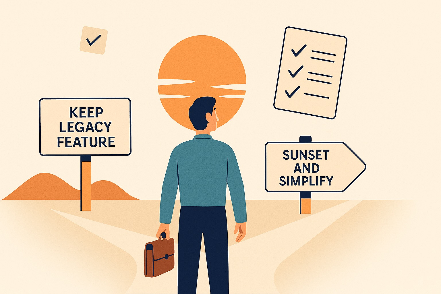
Sunsetting a Feature: A Checklist for Product Managers
A detailed approach followed for deprecating two legacy pages in our product, Fyle

Feature deprecation is becoming as important as feature launches. Here’s a real-world example of how we sunset two legacy pages at Fyle, and the checklist we built along the way to help other product managers do it right.
Hi, I’m Pradyumna Dinni. I’m a Product Manager at Fyle, a B2B expense management software. I’ve been with Fyle for over three years, building and scaling features across different modules, contributing to revenue by building things for market expansion and saving customer churn.
Recently, we decided to deprecate two long-standing pages in our product. In this post, I’ll share how we evaluated that decision, what went into communicating it, and a practical checklist for product managers — especially those working in B2B SaaS.
Before we get started with the content of the blog post, I’d like to give some context and tell you a story, because who doesn’t like stories?
Fyle has three primary user roles:
Spenders, employees who incur business expenses.
Approvers, typically managers who review submitted expenses.
Administrators (admins), who configure and manage the business account.
And internally, we call each roadmap item an initiative.
With the context set, I’d like to jump into the story and tell you my first experience with deprecation.
My first experience with deprecation
One of my first initiatives at Fyle in early 2022 was to remove a page showing all corporate card transactions for spenders. The idea was simple: since expenses were being auto-created from transactions, the page felt redundant.
But the deprecation didn’t go as planned. I lacked product context, and we missed steps like customer communication, identifying workarounds, and preparing internal teams. As a result, the initiative dragged on for nearly a year, affecting customer trust and my confidence.
At the time, I was still learning the product and understanding our customer segments. The backlash we received from customers, even in ways we hadn’t anticipated, taught me a critical lesson. Sunsetting a feature isn’t just a backend cleanup task; it’s a cross-functional decision that impacts users and teams in more ways than one.
I learned an important lesson: sunsetting a feature needs the same attention and rigor as launching one.

What have we learnt?
Fast-forward to 2025. During a roadmap discussion last quarter, our Design Head, Dhvani, curiously asked: “What about the Company Summary page?” It was a good question because we were not focusing on that page in the last few quarters, and not everyone internally had a proper idea of what that page was about! This page — one of two summary pages we had (the other being Team Summary for approvers) — was originally built to give a high-level view of expenses. But it hadn’t seen much engagement recently.
At the same time, our engineering team was migrating the frontend code from AngularJS to Angular. AngularJS to Angular migration has been a major focus for our frontend team over the last few quarters. The migration is essential for better maintainability, performance, and long-term scalability. You can read more about it from our colleagues about migrating the Chrome extension from scratch here and writing end-to-end tests for smooth migration here.
In the same roadmap planning session, our Engineering Manager, Dimple, inquired if these two pages were relevant. If so, they need to migrate these two pages to Angular. Keeping those summary pages would mean more effort for our engineers.
So we added an initiative: “Decide the future of Company and Team summary pages” on our Q2 roadmap.
The objective wasn’t to hastily pull the plug. We wanted to understand:
Are customers still finding value in these pages?
Are there opportunities to improve them meaningfully?
Can the same insights be surfaced elsewhere in the product more effectively?
And crucially, is it worth the engineering effort to migrate them to Angular?
What do these pages have?
Company Summary (for Admins) and Team Summary (for Approvers) show a list of employees with their total amount of incomplete expenses, submitted expenses, reimbursements, and advances.

Reference: Summary page for admins - Company Summary These were originally built for Indian businesses during the pre-COVID era, where reimbursements and advances were common.

But our ICP (Ideal Customer Profile) today is very different — primarily US-based SMBs (Small and Medium-sized Businesses) with simpler, card-driven workflows.
The ability to pivot is what distinguishes successful startups from the rest.
Eric Ries
Applying the lessons: Start with data
This time around, I was determined not to repeat the mistakes I made in 2022. No assumptions. No hasty decisions. I wanted to approach this with a clear head and apply a structured process — starting with data and internal insights before we even thought about deprecation.
Step 1: Usage analytics
We pulled usage data for the Company Summary and Team Summary pages over six months — from October 1st, 2024, to early April 2025. Specifically, we looked at:
How many customers viewed these pages
How many exports were made from each page
This gave us a quantitative sense of activity and whether these pages were still relevant in day-to-day workflows.
Usage data looked like this - Exports: Less than 50 from Company Summary and less than 20 from Team Summary. Users who visited these pages multiple times were also about the same number. Most users had only visited these pages once — likely out of curiosity rather than necessity.
Step 2: Internal conversations
In parallel, I reached out to our Sales and Customer Success teams — those closest to the end users and have a pulse on what truly matters.
Sales Team: I asked whether these summary pages come up during demos or discovery calls with prospects. Are potential customers curious about them? Do they find value or raise questions during evaluations?
Customer Success Team: I wanted to know if existing customers ever reference these pages during check-ins or onboarding calls. Do they request enhancements or mention pain points? Is there a problem that is solved only by these pages in our product? Also checked if any support tickets had been raised in the last 6–12 months specifically around these pages — issues, bugs, confusion, or even requests for improvement.
Before we even approached customers directly, this internal sweep helped us gather a 360° view of usage, perception, and visibility of the two pages.
The responses from the teams were alike - no recent prospect asked about these pages. No requests, questions, or feedback in recent quarters from existing customers either!
This was a strong signal: these pages were no longer essential, which is reflected in low engagement.
Between the lack of usage, low user engagement, and shifting product-market alignment, we had enough evidence to start preparing for a sunset.
Customer validation: No surprises, no regrets
Even after our internal research and data review pointed toward deprecating the Summary pages, we didn’t want to assume customer silence meant customer agreement. We wanted to be doubly sure.
So we launched two carefully crafted customer-facing campaigns:
1. In-app announcement
We added an announcement (via Appcues) directly on the Summary pages themselves, informing users that these pages were scheduled for deprecation. This ensured that any active user of the page would be aware and could raise concerns.
2. Targeted email campaign
We also emailed a curated list of users who had visited the pages multiple times over the last six months or exported data from these pages. These were our most relevant users, and we wanted to give them a heads-up — not just about the deprecation, but about what they could use instead.
Offering alternatives: The guide to employee spend summary
To support users, we created a detailed document outlining:
Feature alternatives within Fyle that provide similar or better value.
How to achieve the same outcomes using more modern, supported tools, like Copilot, our AI assistant, helps users query their data and navigate the product with ease, and the Spend Overview page, which visualizes trends across categories, departments, cards, and employees — offering a more actionable lens than static tables.
We linked this guide in both the Appcues banner and the email. The goal: give users time, clarity, and confidence to adapt.
Grace period and listening window
We didn’t rush. We gave users a 2–3 week buffer — clearly communicating that the pages would be deprecated on a fixed date, approximately 20 days after the announcement. This gave them enough time to:
Explore the suggested alternatives
Understand the rationale behind the decision
Reach out with any objections or concerns
The result
Not a single customer objected. No new tickets. No unexpected feedback from Sales, Customer Success, or support during the entire window.
So, with all stars aligned, we finally hit the button — the Summary pages were officially deprecated.
This initiative was rolled out smoothly, thanks to our Engineering Manager, Dimple, and our Member of Technical Staff, Vaibhav. They helped me promptly with data, sharing their thoughts, and gave us time to take calls and deprecate the two pages.
Here’s the checklist:

When done right, deprecating a feature simplifies your product, respects your users, and frees up team bandwidth to build what really matters.
When done wrong, it can shake customer trust and burn valuable effort of everyone involved.
If you’re a PM facing a similar call, I hope this story and checklist help you make it with confidence.
Dimple and I worked on that 2022 initiative that didn’t go well. During our initiative reflection call recently, she mentioned that the deprecation initiative for summary pages was “as smooth as butter!”
I may have completed the redemption arc! 😇
nice read!!