
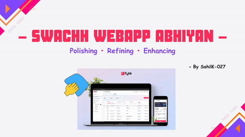
Swachh WebApp Abhiyan: A Call for a Cleaner, Consistent Fyle App
Tackling UI inconsistencies and raising the bar for a cleaner and unified product ✨

A great product is the result of teamwork and collaboration among individuals with diverse skill sets, perspectives, and preferences. When developing a complex application, various design choices, changes in content, and differing implementation styles can sometimes lead to inconsistencies. Over time, these inconsistencies can accumulate, some are noticeable, while others are subtle, and they ultimately affect the overall user experience.
This situation is not unique to Fyle; it occurs with every product that grows and evolves. The only way to address these inconsistencies and usability gaps is through continuous effort, tackling them one by one, day by day, until the experience feels seamless.
This is when the Swachh Web-App Abhiyan was born. The initiative focused on cleaning, refining, and fixing the app, bringing everything together under one unified experience. The goal was simple: to make the Fyle web app feel like a single, well-thought-out product rather than a collection of separately built components.
The Genesis! 🐣
In December 2024, I had just wrapped up an initiative on the mobile app, ensuring that stats displayed exact amounts instead of rounded values. I was ready for my next challenge, and that’s when an opportunity came up to work on a high-impact cleanup of the Fyle Web App — addressing inconsistencies in UI elements like buttons, shadows, spacing, font sizes, border radii, sentence casing, and fixing functionality bugs in edge cases.
At first, the fast-paced nature of the initiative felt overwhelming. I had never worked on anything similar before. However, it also presented the opportunity to work on almost every part of the Fyle Web App, which is a rare chance. I have always enjoyed organizing things (creating order out of chaos 😅) and ensuring seamless experiences. This initiative felt like the perfect opportunity to achieve that on a larger scale. It was about giving the web app the polish and consistency it deserved. And so began my journey with what we fondly call the Swachh Web-App Abhiyan.
The Plan and Roadmap! 🗺️
Once the initiative kicked off, the first step was to take stock of everything that needed fixing. But instead of a structured approach with documentation, we opted for something simpler: a thread-based system.
Each part of the web app or usability issue had its dedicated Slack thread. A thread would list all the inconsistencies, broken UI elements, or functionalities that needed attention.
Some threads were obvious: buttons that looked different across pages, mismatched font sizes, and uneven spacing. Others were more intricate, requiring deeper discussions across engineering, product, and design teams, like refining the receipt viewer experience or reworking the sidebar colors. Then there were the frustrating ones, tiny functional breaks that surfaced only in edge cases, often going unnoticed until a user stumbled upon them. None of these were showstoppers on their own, but together, they added up to a fractured experience. Clicking around the app, you could sense the lack of cohesion like a house with rooms designed by different architects, each following its blueprint. It wasn’t bad, but it wasn’t seamless either.
Each of these threads became a to-do list of sorts, with multiple items being tackled simultaneously by the team. With three engineers (Aditya, Amit, and me) actively working on different parts, we needed a way to keep track of ownership without overcomplicating things. That’s when we introduced a fun little system of emoji markers. Each of us picked a unique emoji to tag our threads: 🐬 for me, 🆎 for Aditya, and 🐧 for Amit.
This tiny addition made it much easier to glance through threads and instantly know who was working on what. It also added a bit of personality to the otherwise fast-paced and intense process.
Day by day, thread by thread, the cleanup was in full swing.
The Cleanup Begins! 🏁
As the weeks passed, we tackled a variety of issues, ranging from subtle inconsistencies to more visible usability problems. Some fixes were small but impactful, while others required a complete revamp of certain components. Here’s a breakdown of the key improvements we made and their impact:
🔸 Bringing Sentence Case & Language Consistency
Across all platforms, Web App, Mobile App, Chrome Extension, Outlook Add-in, and Integrations, we standardized text formatting, sentence casing, and tone to create a more polished and professional look.
With over 1,000+ files containing UI text, manually reviewing and fixing them was out of the question. Instead, we wrote a custom script to scan all HTML templates, extract placeholders and text within tags, and automatically apply the correct casing. But automation alone wasn’t enough, we had to manually review and test every change to ensure accuracy.
What seemed like a simple fix turned into a 2-3 week effort, but in the end, it made a huge difference.
Impact: A cleaner and visually consistent experience that improved readability across the app.
🔸 Making Tables (List-views) More Intuitive
Tables are at the heart of financial management, so we focused on making them more flexible and user-friendly:
✔ Drag-and-drop support for reordering table columns.
✔ Column resizing to let users adjust views as needed.
✔ Info icons with contextual explanations where relevant.
Impact: Enhanced control over data visualization, making it easier to customize tables for different workflows
🔸 Subtle UI & UX Enhancements That Made a Big Difference
Sometimes, it’s the little things that make an app feel refined. We focused on polishing micro-interactions and visual elements:
✔ Smooth icon animations for a more delightful experience.
✔ New sidebar colors to improve visual hierarchy.
✔ Standardized hover states for buttons, close icons, and search fields.
✔ Redesigned export dialog for better usability.

Impact: A more polished UI that just feels better and consistent.
🔸 Dashboard Enhancements
We made dashboards more insightful and intuitive:
✔ Added team expense stats for approvers in web and mobile apps.
✔ Introduced a payment mode filter in My Expenses for better tracking.
✔ User greetings on the dashboard to add a personal touch.
✔ Improved corporate card management, making it easier to add and view cards from zero-state screens.
Impact: Smarter dashboards and better data visibility, making financial tracking even easier.
🔸 UI Cleanup & Visual Consistency
A layer of polish involved modernizing outdated visuals and fixing inconsistencies across the app:
✔ Redesigned login & logout pages with a fresh, modern & minimalist look.
✔ Replaced outdated illustrations with cleaner, more relevant visuals.
✔ Fixed the Receipts/PDF Viewer, ensuring images and PDFs display in the correct aspect ratio.
Impact: Visually modernized app that feels more intentional.
While these were some of the major changes, the full scope of this initiative was much larger. In total, we tackled, fixed, and closed 125 threads, each addressing a specific inconsistency, bug, or usability issue.
Each fix, no matter how small, contributed to making Fyle a cleaner, more seamless, and more delightful experience.
Learnings & Achievements! 🏆
This initiative was intense, fast-paced, and filled with valuable takeaways. Beyond just shipping features and fixes, I learned how to work smarter, collaborate better, and make decisions with impact. Here are some of my biggest learnings:
🔸 Staying Aligned Across Teams Matters
With multiple teams working in parallel, I realized the importance of keeping track of everything happening across different initiatives. Following different channels like product_bulletin, product, and product_design kept me updated on ongoing discussions. Since we were rolling out multiple changes, I also monitored ongoing Angular migrations and joined several Q1 initiative channels to ensure our work didn’t conflict with other improvements.
🔸 Zooming Out for Better Consistency
I learned to step back and take a broader perspective when making changes. Instead of implementing fixes in isolation, I started checking:
✔ How similar components were built in other parts of the app.
✔ If variable names and content followed a consistent pattern.
✔ Whether UI elements are aligned with our design system and language.
This approach helped maintain uniformity across the app and improved both the codebase and UI in the long run.
🔸 Debugging & Problem Solving Got Easier
Compared to last quarter, I became more efficient at breaking down problems and finding solutions. Debugging, which sometimes felt tedious, became much simpler and structured.
🔸 Realization: Reviewing PRs is Harder Than Raising Them
One unexpected realization was that reviewing pull requests (PRs) can be tougher than raising them. When you're writing code, you have complete context, you know why you made certain choices, what trade-offs you considered, and how everything fits together. But you don't have that luxury when reviewing someone else’s PR.
I found myself spending more time understanding the "why" behind the changes rather than just checking the code itself. Some PRs touched multiple parts of the app, making it even harder to verify their impact without deep-diving into different flows. This experience made me more mindful of changes before requesting a review. I started:
✔ Reviewing my PRs before assigning them.
✔ Adding detailed comments explaining why I made specific changes.
✔ Ensuring PRs were well-structured to reduce unnecessary back-and-forth discussions.
✔ Provide screenshots or screen recordings for UI-related updates.
These practices not only accelerated the review process but also enhanced the readability and maintainability of the codebase.
🔸Backing Arguments with Real Data
Instead of relying purely on intuition, I learned to validate my decisions with actual customer data. Whether it was running DB queries or analyzing tracking metrics, these data-driven approaches made decisions:
✔ More objective and impactful.
✔ Easier to justify when discussing with product or design teams.
🔸 Automation = Time Saver
I saw firsthand how automation reduces manual effort and improves efficiency.
✔ Writing scripts to scan and fix inconsistencies.
✔ Adding linting rules to enforce standards automatically.
✔ Configuring end-to-end (E2E) tests for better reliability.
✔ Setting up GitHub workflows to streamline development.
Each of these saved time, reduced errors, and made the overall development process smoother.
Wrapping It Up! 🙇
The Swachh Web-App Abhiyan wasn’t just about fixing inconsistencies, but it was about rethinking how we build, refine, and maintain a product.
This initiative pushed me to zoom out, debug more efficiently, and collaborate across teams. More importantly, it reinforced a key lesson: Great products aren’t built overnight; they’re the result of continuous iteration, attention to detail, and a shared commitment to quality.
And the best part? The app feels cleaner, more intuitive, and more delightful to use, which was the goal all along.
A huge thanks to Abhishek and Dimple for this opportunity, Aditya for reviewing countless PRs, Amit for all the help with the development, Hari, Sri Ashwathi, and Dhvani for their lightning-fast & well-thought-out designs, and Meeha for all the product and content support. This was truly a team effort! 🎉
Looking ahead, the goal remains the same: keep improving, keep refining, and never stop making things better.
Happy Coding! 🧑💻