
The Joys and Crimes of Email Development
Revamping 50+ emails at Fyle introduced me to the delightful, quirky world of email development where <table>'s reign and JavaScript is banned.

Hello there! I’m Harshal, an MTS-1 at Fyle. A few months ago, I found myself deep in the wonderfully chaotic world of Email Development, a journey that turned out to be exciting and way more complicated than I ever imagined.
In this post, I’ll share how we revamped 50+ emails, from research to rollout, plus a few moments that had me both laughing and screaming into the void. Let’s dive in.
What Makes Email Development So Different from Web?
At first glance, email development looks straightforward, just some HTML and CSS. But once you dig in, you realize it’s a whole different world with its own set of rules. Here’s what makes it so unique.
🎯 Web Browsers vs Email Clients
While web browsers (like Chrome, Safari, and Firefox) are designed to render modern websites using shared standards and engines, email clients (like Gmail, Outlook, and Apple Mail) are built specifically to display email messages, often with their own rendering engines and rules.
Because email clients prioritize security, performance, and offline support, they don’t fully support modern web features.
🎯 Emails Don’t Run, They Render
JavaScript is entirely blocked by email clients as emails are meant to be read and they’re designed to display content safely.
Even Google’s AMP for Email which enables interactivity like carousels and forms, avoids JavaScript. Instead, it uses custom components that keep things lightweight and secure.
🎯 Image Handling & Spam Sensitivity
Many email clients including Outlook, Gmail (web), and Yahoo Mail block images by default for security reasons. That’s why it’s important to have fallbacks.
Unlike web pages, emails must pass through spam filters before reaching an inbox. Even a messy code structure or certain keywords can raise red flags.
This blog by SendGrid lists common triggers and tips to stay out of the spam folder.
🎯 Debugging Emails Is Like Archaeology 😆
Unlike browsers, email clients offer no inspect tools or dev consoles. Debugging is manual - testing across platforms and learning through iterations.
Any mismatch in data, or small code flaw can break rendering, clip content, or prevent delivery entirely.
In short, Email development comes with its own set of constraints, quirks, and unexpected behaviors. But once you master the rules, you can craft reliable, beautiful emails that shine across (almost) any inbox.
Development Journey in Three Phases
By now, you’ve seen how strange and specific the world of email development can be. Here’s how my own journey unfolded, not just a task, but a full-on expedition that involved planning, coding, testing, (lots of testing), and cross-team coordination.
🧭 Phase I: Laying the Groundwork - Research & Setup
Before jumping into code, I took a step back to understand the unfamiliar world of email development. With so many hidden quirks and client-specific behaviors, the real work started with research before the code editor.

🔹 Email Client Compatibility Investigation
I started by creating a document that mapped out all the CSS properties we planned to use, from layout and typography to spacing and checked their compatibility across major email clients.
The doc included:
A compatibility matrix of planned CSS properties - referenced from caniemail.com
Notes on known quirks or workarounds from resources like EmailOnAcid and SendGrid.
A client / device usage breakdown based on internal metrics to prioritize what mattered most
This reference became my north star throughout the development and honestly, it saved me more times than I can count.
🔹 Dev Environment & Email Rendering Pipeline
The next step was to understand how the email system worked end to end. So I dug up the backend codebase and traced the full notification flow: from the triggering event to the final payload sent by our email service.
The email flow isn’t just one service, it spans across multiple layers of our system, each responsible for a part of the process. Here's a simplified view of how it worked:

User Interaction triggers an event in the system like submitting a form or completing an action or this can be a scheduled job.
This kicks off the business logic for email generation workflow, which is picked by the notification service.
The email layout and content are then generated by dedicated services. These services communicate via APIs to compile the final email structure.
Finally, the email is passed to our mail delivery provider SendGrid, which handles delivery to the user’s inbox.
I spun up private branches across the repos involved, deployed them to a test environment, and manually triggered emails through the UI. This setup gave me room to experiment and tweak things with real data in place.
⚙️ Phase II: Development – Designing, Coding, and Fighting Bugs
In the world of emails, modern layouts take a backseat. Instead, good old <table> based HTML is your most reliable companion. But even with those time-tested techniques, there’s no guarantee things will just work.
The development phase was full of surprises. Here are a few of my favorite (and confusing) discoveries.
🔹 The Gmail Box Shadow Mystery
Somewhere between “this style doesn’t work” and “why does it work there but not here,” I stumbled upon this:
Gmail App supports
box-shadowbut only for non-Google accounts.
It would’ve made sense the other way around, right? Support it on Gmail accounts to promote your own product. When I first found this, this is exactly how I felt about Google for making my life difficult:

There’s no straight answer to why it works this way, but this deep dive by Rémi Parmentier does a great job breaking it down to possible causes.
🔹 The Invisible Character That Broke Gmail
At one point, Gmail started clipping my email for no reason. Hours of diffing later... the culprit? A single invisible Unicode character, pasted straight from Figma was enough to push Gmail’s 102KB rendering limit.
Now I double-check every copy block and never trust pretty text.
🔹 Outlook Fixes (Witchcraft Edition)
Outlook Classic uses Microsoft Word as its rendering engine. Yes. Word for email rendering. The only way to overcome layout mishaps is to use MSO (Microsoft Office) specific conditionals and write supported code inside:
<!--[if mso]>
  <table>
     <!-- Outlook-specific content -->
  </table>
<![endif]-->
These conditionals help prevent layout shifts and keep things aligned in Word-based clients without affecting others.
To add to the fun, Outlook doesn’t support rounded corners natively, you’ll have to lean on an ancient markup language called VML (Vector Markup Language) to implement those stylish buttons.
🔹 That Sneaky Line of Preheader Text
We added custom pre-headers, the snippet that shows up next to your subject line in the inbox preview, but nowhere inside the email. It helps set context and improve clarity.
It’s also great for deliverability: a well-crafted preheader can reduce the chances of getting flagged by spam filters. Small touch, outsized impact.
🚀 Phase III: Release & Final Validation
This is the part where the emails leave the comfort of dev and meet the real world. And unlike web pages, emails don’t come with hotfixes, once they land in a user’s inbox, you’re done. So we took testing and validation seriously.
🔹 Testing Across the Inbox Universe
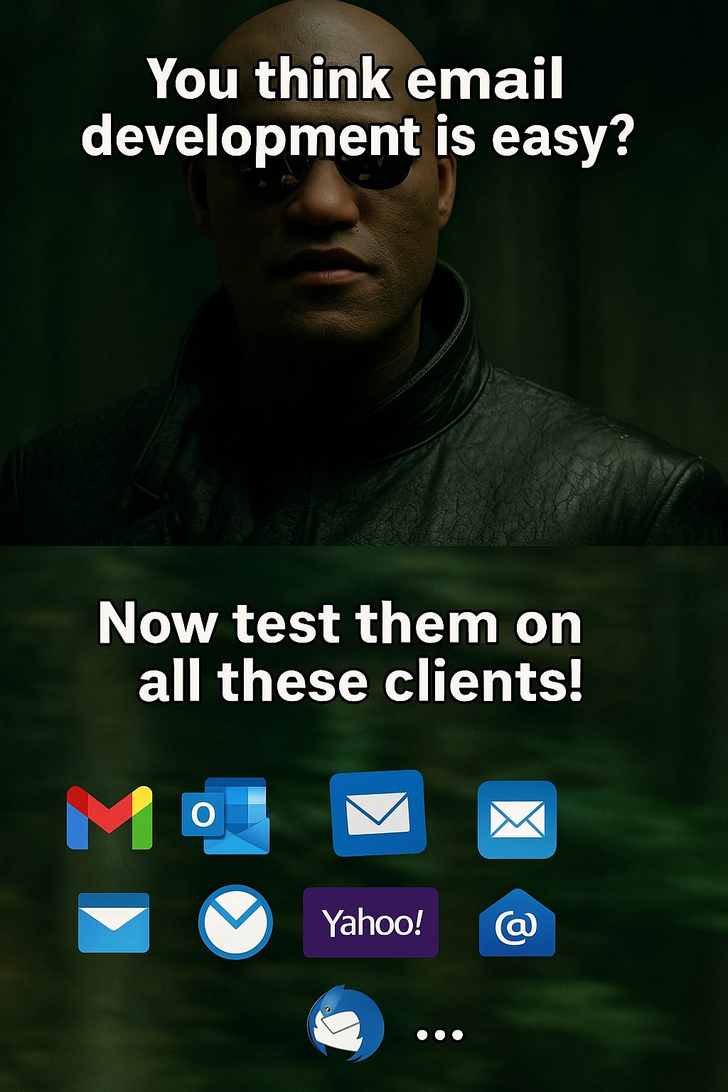
Once things looked good technically, our product and design teams jumped into staging and took QA to the next level. From 1px misalignments to button spacing issues on narrow screens, they caught what tools couldn’t. We tested our emails across ~8 different clients and multiple types of devices. The list included:
Gmail (web, Android, iOS)
Outlook (Office 365, classic desktop)
Apple Mail (macOS, iOS)
Yahoo, Proton Mail, and a few others
Every client had its own rules. What looked perfect in Apple Mail might break in Outlook, or wrap oddly in Yahoo.
RIP Windows Mail 🪦
We’d done a fair bit of development and testing with Windows Mail in mind. But just as we were wrapping up, Microsoft announced they would retire the app starting Jan 2025, in favor of a new Outlook version which uses a modern rendering engine.
It was one of those classic dev moments: you spend days battling platform-specific bugs, only to find it’s being phased out.
Still, the effort wasn’t wasted, many of the same fixes helped with older Word-based clients too.
Conclusion
Revamping 50+ emails was more than just a design refresh, it was a deep exploration into the wonderfully weird realm of Email Development. From balancing old-school <table> layouts, to debugging invisible Unicode gremlins, writing Python code for content, and validating every last edge case - it was a journey.
A huge shoutout to my colleagues, Hari from the design team and Jishnav from the product team for the beautiful visuals, thoughtful copy, and going all-in on QA. Their contributions made these emails not just reliable, but on-brand and delightful.
To summarise:

If you’ve ever wrangled Outlook conditionals, hit Gmail’s 102KB limit, or found joy in a perfectly aligned <td>, I’d love to hear your story too.
Thanks for reading and may your emails render clean, your tables nest true, and your box-shadows always show up 📨✨