The story of how we re-designed Fyle’s Spender Dashboard
Hey, folks! I am Shubhangi, and I work at Fyle as a product designer. I joined Fyle as a newly graduated designer over a year ago, and in all this time, I have had the opportunity to work on several complex and exciting problems. This project was no different.
At the beginning of 2022, we at Fyle decided to revamp our existing spender dashboard to provide users with a better, user-friendly, and more efficient dashboard.
A Spender is any person who uses Fyle to get reimbursed for their business expenses or get approval for expenses they have done through a corporate card.
The dashboard is the page they view the first time they log into Fyle. It displays a set of necessary information and controls to make the usage of our app more efficient.
Most often, our users use Fyle without any prior understanding of how they can use Fyle. This makes it immensely important for us to create an intuitive experience.
Why re-design?
We did an in-depth study to understand our user’s pain points concerning the existing dashboard and their overall behaviour while using Fyle.
One of our users pointed out that “I’d like to see this dashboard simplified to the point where I can see what's strictly essential for me, with options to drill down further if needed.”
1. Hierarchy of information was not clear
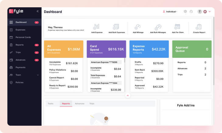
The old design consisted of various functionalities and data for the spender to view.
However, we noticed that not all information was equally useful to the users. We dove into the usage data and found that some of the features were being used more than the others. The old design consisted of various functionalities and data for the spender to view.
Another problem was that there was no clear data segregation based on the usage. The accordion structure made it difficult to view tasks and overwhelmed the user with many stats. We sought to fix this problem during the redesign.
2. Tasks section was not prioritised
One of the major pain points of our users was not knowing that they had to complete expenses and create and submit reports for approval. Tasks as a feature provided a space on the dashboard to remind users about things pending on them.
However, tasks were not prioritized or highlighted enough for the users to view.
3. Adding an expense could be simplified
Adding an expense is one of the most common actions on the dashboard. There are five different ways in which a user can create expenses. However, one of these is used 82% of the time, but all five methods of creating an expense were given equal importance/priority on the dashboard.
4. Removing sections that were not in use
There were certain sections on the dashboard, such as the Fyle Ad-ins, the Reports and Advances sections on tasks that reported less usage. These contributed to an added level of complexity and made it difficult to focus only on what is important.
Our Goal
From our user research + analysis of the old design, we knew that the dashboard had to be simplified, and a clear hierarchy of information had to be maintained. Our goal was simple:
Create a dashboard that allows the user to submit expense reports in the least amount of time
We also wanted to keep the web app experience consistent with our mobile app to an extent, so that the users don’t have to learn separate behaviours on two different platforms.
Wireframing and Exploration
Exploration is one of the most critical parts of any design project. This was when we discussed several ideas and even experimented with some out-of-the-box solutions.
Some Important Design Decisions
Improving the Information Architecture
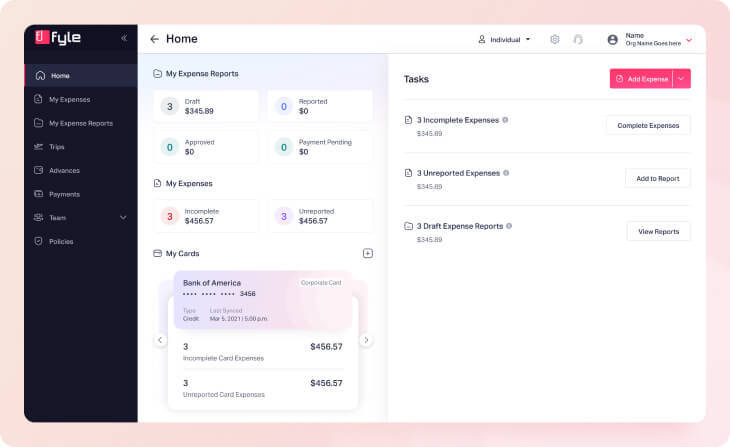
We clearly segregated all the information we wanted to show on the dashboard into:
Stats
Actionable Tasks
Making Add Expense more efficient
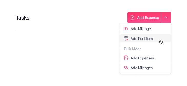
As mentioned earlier, 82% of the time, users used the add expense button, while the other four ways of adding expenses (add mileage, per diem, bulk add expense, bulk mileage).
We introduced a single split button instead of having 5 different CTAs (like in the old design).
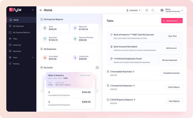
Segregating & Prioritising Tasks
Tasks were further divided into:
Urgent Tasks (these would be conditional and would only appear every once in a while)
Frequent Tasks (these would appear more frequently and need the user’s attention almost every month)
Providing Visibility to Cards
90% of spend on Fyle is card spend. Hence, it made sense for us to provide more visibility of card spend and even add additional functionalities on the dashboard to make the experience more convenient.
Users can now add a personal or a corporate card from the dashboard. It gives visibility of the cards already added and the incomplete and unreported expenses for each card added. We also made the card UI more personal and distinguishable for different types of cards (i.e., corporate and personal cards).
Final Design
User Testing
Every designer knows that no design is perfect. We needed to understand the perspective of our users to know what was working and what needed to be improved with the new designs. We approached some of our current spenders who use Fyle to test the user flow with the help of prototypes.
This helped us gain some interesting insights, based on which we made improvements and fixed minor issues...and Viola! The designs were ready for implementation.
Of course, things don’t end at implementation either. Once the designs are implemented, we will track usage for tasks and stats, get feedback from users regarding the problems they are facing, and continue to iterate to provide the best experience for our users.
Before I wind up...
Like any company project, this one was also a team effort. Harsh Thacker helped me with the design process and aided in making crucial design decisions. Aditya Bansal defined the project's scope and assisted in conducting successful user testing sessions. Yashwanth Madhusudan and Swapna Ranjit Nayak provided critical and valuable feedback and support during the entire initiative.


